


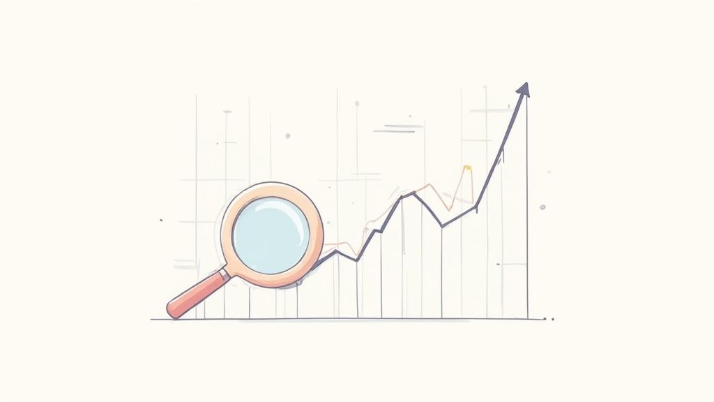
Learning how to read stock market charts is like learning the secret language of money. It’s a visual story of the constant tug-of-war between buyers and sellers, a skill legendary traders like Jesse Livermore mastered over a century ago. The core idea is simple: understand the price's past moves to guess what might happen next.
Your First Look at Stock Charts
Ever glance at a stock chart and feel like you're staring at an alien language? You're not alone. Think of a chart as the market's heartbeat, telling the story of a company's stock through its price changes. We'll skip the heavy jargon and focus on what these lines and colors really mean.
Before modern digital charts, traders had to get creative. One of the earliest forms of analysis was reading ticker tape, popular all the way until the mid-1960s. This meant analyzing market data from paper strips printed by stock tickers. A crazy fact: Thomas Edison, the guy who invented the lightbulb, actually invented an early version of the stock ticker!
Traders like Jesse Livermore relied heavily on this method, using price and volume data to spot market trends without the fancy charts we have today. If you're curious, you can explore more about the history of technical analysis and its evolution.
The Four Key Pieces of Price Information
At its core, a chart is just a visual story of data. Every period on a chart – whether it's one minute or one day – tells you four essential things about the stock's price. Nailing these is the first step to reading any chart. They are the building blocks of every pattern and trend you’ll eventually learn to spot.
Every chart tells a story using four main data points for a specific period (like a day or an hour). Understanding these is step one.
| Data Point | What It Tells You | Why It Matters |
|---|---|---|
| Open | The very first price a stock traded at when the market opened for that period. | It sets the initial mood and gives you a starting line for the day's action. |
| High | The absolute highest price the stock hit during that specific period. | Shows how excited buyers got; it's the peak of optimism. |
| Low | The absolute lowest price the stock dropped to during that period. | Shows how nervous sellers got; it's the peak of pessimism. |
| Close | The final price the stock traded at when the market closed for that period. | Many pros see this as the most important price, showing who won the day's battle. |
This data might seem simple, but it’s the DNA of market analysis. These four points are what create the different shapes and colors you'll see on more advanced charts, which we'll dive into next. Think of them as the alphabet – once you know the letters, you can start reading words.
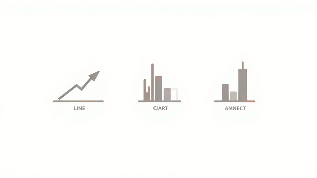
Choosing Your Chart Type
When you're trying to figure out a stock's story, not all charts tell it the same way. Think of them like different camera lenses – some give you a wide, sweeping view, while others zoom in on the gritty details. Picking the right one is key to seeing what’s really happening with the price.
Let's break down the three main types you'll run into everywhere.
It helps to think of these charts as an evolution. For centuries, traders have been trying to visualize market data to get an edge. What we use today, like Japanese candlesticks, is the result of a long history of innovation. Pioneers like Charles Dow, the brain behind the Dow Jones Industrial Average, helped turn simple price tracking into a legit analytical tool.
The Simple Line Chart
First up is the line chart, the most basic view you can get. It’s literally a connect-the-dots picture of a stock's closing prices over a set period.
This chart is perfect for getting a quick, clean look at the overall trend. Is the stock generally heading up, down, or just drifting sideways over the past year? A line chart shows you this at a glance. The big drawback? It completely ignores all the drama that happened during the day – the highs, the lows, and the battle between buyers and sellers.
The More Detailed Bar Chart
Next, we have the bar chart, which adds a few more layers to the story. Instead of just a single dot for the close, you get a vertical line for each period (like a day or an hour). This line represents the entire trading range, from the highest high to the lowest low.
Sticking out from this bar are two small horizontal lines, or "ticks":
- The left tick: This shows the opening price.
- The right tick: This shows the closing price.
Bar charts give you a much better feel for volatility. A long vertical bar means the price swung wildly, while a short one signals a calm, quiet trading session.
The All-Powerful Candlestick Chart
For most traders, the real star of the show is the candlestick chart. It packs the exact same four pieces of data as a bar chart (open, high, low, and close) but presents them in a way that's far more visual and easy to read. Honestly, once you get the hang of these, you probably won't want to go back.
Each "candle" is made of two parts:
- The Body: This is the thick, rectangular part. It shows you the range between the open and close price.
- The Wicks (or Shadows): These are the thin lines poking out from the top and bottom, showing the day's absolute high and low.
What makes candlesticks so powerful is the color. A green (or white) candle means the stock closed higher than it opened – a good day for the bulls (the buyers). A red (or black) candle means it closed lower – a win for the bears (the sellers).
This instant color-coding tells you the market's mood in a split second. A long green candle screams strong buying pressure, while a long red one signals heavy selling. Learning to interpret these shapes and patterns is a foundational skill in understanding how to read candlesticks.
Spotting Trends and Key Price Levels
Alright, now that you know what the candlesticks and bars on a chart are telling you, it's time for the fun part: reading the market's mood. Think of it like looking at a mountain range from a distance. Is the general direction heading up, sloping down, or just moving sideways?
Learning to spot these big-picture movements is one of the first major hurdles in understanding how to read stock charts.
This isn't just a technical skill for making money; it’s about understanding market psychology. Even legendary investors who aren’t glued to charts, like Warren Buffett, get the power of market sentiment. He famously said, "Be fearful when others are greedy and greedy when others are fearful." Seeing trends on a chart is a direct, visual way to see that greed and fear playing out in real-time.
Identifying the Main Trend
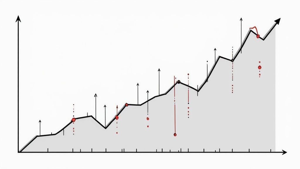
You’ve probably heard the saying, "the trend is your friend." It gets repeated so often because it's true. The trend is simply the overall direction a stock's price is heading. It boils down to three types:
- Uptrend: Picture a staircase going up. The chart is making a series of higher highs and higher lows. This tells you buyers are in control, consistently pushing the price higher.
- Downtrend: This is the opposite – a staircase heading down. You'll see a distinct pattern of lower highs and lower lows. In this case, sellers have the upper hand.
- Sideways Trend (Consolidation): The price seems stuck, bouncing around within a specific range without making any real progress. Buyers and sellers are basically in a standoff.
A quick way to make the trend pop off the page is to draw a simple trend line. For an uptrend, just connect the lows. For a downtrend, connect the highs. This simple line can instantly clarify the market's direction.
Understanding Support and Resistance
This is where chart reading really starts to get interesting. Support and resistance are two of the most fundamental concepts you'll ever learn, and they are incredibly powerful.
Think of them as a floor and a ceiling that the stock price is trapped in.
- Support (the floor): This is a price level where a downtrend often hits the brakes or even reverses. Why? Because enough buyers see the stock as a good deal at that price and step in, stopping it from falling further. It’s a psychological floor.
- Resistance (the ceiling): This is a price point where an uptrend tends to run out of steam. Selling pressure gets stronger than buying pressure, creating a ceiling that the price struggles to break through.
These levels aren't magic; they're created by group psychology. When a stock approaches a previous high, some investors who bought lower decide it's a good time to sell and take profits. That selling creates resistance. On the flip side, when a stock drops to a previous low, other investors see a bargain and jump in, creating support.
A quick heads-up: these levels aren't unbreakable laws. They are simply areas where the probability of a price reversal is higher. A stock can absolutely smash through support or resistance, especially with a lot of people trading (high volume) – and that breakout is a powerful signal in itself.
Spotting these levels gives you a map of the battlefield, showing you where the big fights between buyers and sellers are likely to happen. It's crucial because markets can be wild. Historical data shows that even in years the market ends with big gains, scary drops are just part of the game. Since 1928, the S&P 500 has had an average drop of about -16.4% within each year. Knowing where potential support is can make that ride a lot less stressful. You can discover more insights about historical market behavior here.
Using Indicators to Get a Deeper Read
Alright, once you've got a feel for spotting trends and key price levels on a chart, it's time to bring in the heavy hitters. These are your indicators, and they're like getting a second opinion from a smart friend before you make a move.
We're not going to overwhelm you with a dozen different tools. Instead, let's focus on a couple of the most trusted indicators out there, plus the one thing many beginners ignore: trading volume.
Think of it this way: the price chart tells you what is happening. Indicators and volume help you understand why it's happening and how much power is behind the move. They add that extra layer of context that separates a wild guess from an educated decision.
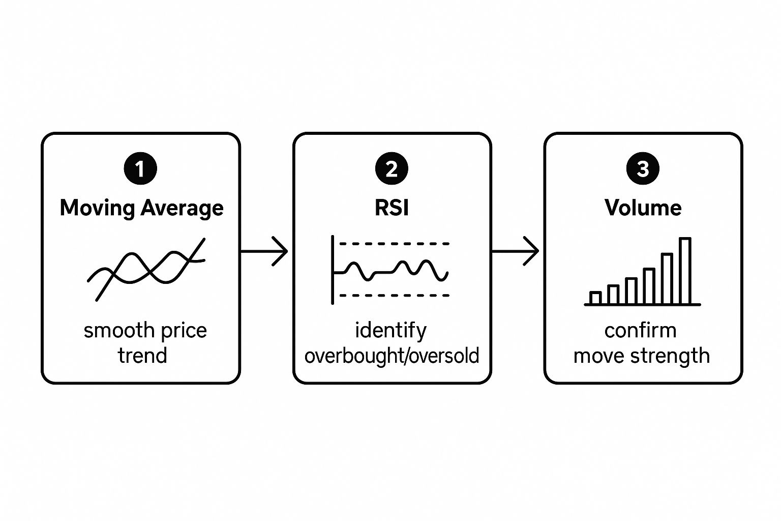
This simple flow is how experienced traders approach a chart. You start with a Moving Average to get the general direction, check an indicator like the RSI to gauge momentum, and then look at volume to see if the move has any real power behind it.
Smoothing Out the Noise with Moving Averages
First up is the Moving Average (MA). It’s one of the most popular indicators for a simple reason: it helps. Its main job is to cut through the day-to-day chaos of price swings and show you the underlying trend more clearly.
It does this by averaging the closing price over a set number of days, like 20 or 50, and plotting that as a single, smooth line on your chart. When the price stays consistently above this line, it’s a strong signal that you're in an uptrend. If it's trading below the line, that points to a downtrend. It's a fantastic, no-nonsense way to get your bearings.
Is the Stock Overheated or on Sale?
Next, let's look at the Relative Strength Index (RSI). This is a momentum indicator. It basically measures how fast and how big recent price changes are to tell you when a stock might be "overbought" or "oversold."
The RSI is shown as a line that moves between 0 and 100. Here’s the simple way to read it:
- A reading above 70 suggests the stock is overbought. Buyers have been piling in, and it might be running out of gas and due for a price drop.
- A reading below 30 suggests the stock is oversold. Sellers have been dumping it, and it could be getting cheap enough to attract buyers for a bounce.
Think of the RSI like a car's engine meter. If the engine is revving in the red zone (over 70) for too long, you probably need to ease off the gas. If it's sputtering and about to stall (below 30), it might be time for a tune-up. It’s a gauge of market excitement.
The Importance of Trading Volume
Finally, we have to talk about Volume. This might be the single most underrated piece of information on a chart, but it's critical. Shown as bars at the bottom of your chart, volume simply tells you how many shares were traded in a given period.
So, why is this so important? Because volume is the fuel behind any price move. It shows you how confident the market is.
Imagine a stock jumps 5%. On its own, that looks great. But if it happened on super low volume, it’s not very convincing – it's like one person managing to push a car a few inches. Now, if that same 5% jump happens on massive volume? That’s like a whole crowd getting behind the car and shoving it down the street. That's a move you need to pay attention to, as it shows lots of people believe in the new price.
These core ideas of price, momentum, and volume aren't just for stocks. They're universal principles that apply across different markets. In fact, you'll find similar concepts when it comes to reading cryptocurrency charts and indicators as well.
A Practical Chart Analysis Framework
Knowing all the individual pieces of a chart is great, but the real magic happens when you start putting them together to read the market's story. Think of it like learning the alphabet versus reading a book.
What you need is a repeatable process – a consistent framework you can use every single time you pull up a chart. This helps build confidence and turns a chaotic screen of data into a clear story.
As the legendary investor Warren Buffett says, "Risk comes from not knowing what you're doing." This framework is your first step toward knowing exactly what you're doing. It all boils down to asking the right questions in the right order.
Your 5-Step Chart Reading Checklist
I like to think of this as a pre-flight checklist before making any trading decision. It forces you to cover the essential bases and stops you from getting laser-focused on just one thing.
Let's walk through this simple but powerful framework that helps you analyze any stock chart you come across.
| Step | Action Item | Key Question to Answer |
|---|---|---|
| 1 | Identify the Trend | Is the stock in a clear uptrend, downtrend, or just moving sideways? |
| 2 | Spot Key Levels | Where are the most obvious support (floor) and resistance (ceiling) levels? |
| 3 | Check the Volume | Does the trading volume confirm what the price is doing, or is it telling a different story? |
| 4 | Look at Indicators | What are the Moving Averages and RSI telling me about momentum and strength? |
| 5 | Form a Thesis | Based on everything I see, what is the most likely direction for the price to go next? |
This checklist turns a potentially confusing jumble of lines into a structured analysis. It gives you a story, not just a snapshot.
Let's apply this to a real-world example, say, a chart of Tesla (TSLA).
First, you’d zoom out to get the big picture. What’s the main trend over the last six months? Is it making higher highs (uptrend) or lower lows (downtrend)?
Next, you'd start drawing. Mark horizontal lines where the price has repeatedly bounced up from (support) or struggled to break through (resistance). These are the battlegrounds.
After that, glance down at the volume bars. Did that last big price jump happen on a huge spike in volume? That’s a powerful confirmation. A move on low volume is way less convincing.
Finally, pull up your indicators. Is the price trading above its 50-day moving average? Is the RSI screaming overbought (above 70) or oversold (below 30)?
By answering these questions one by one, you build a complete story about the stock's current situation. This systematic approach is the foundation of solid chart analysis. For anyone looking to go a step further, exploring the basics of technical analysis will add even more powerful tools to your toolkit.
Common Questions About Reading Stock Charts
Jumping into the world of stock charts can feel like learning a new video game – you get the goal, but the rules and special moves can be a bit of a blur. It's totally normal to have questions.
Let's clear up some of that initial fog and tackle the things most beginners wonder about.
How Much History Should I Look At On A Chart?
That’s a fantastic question, and honestly, it all depends on your goals. Are you a day trader trying to make a quick profit in a few minutes? If so, you might only care about what’s happened in the last few hours.
But if you’re a long-term investor playing the Warren Buffett game, looking at charts that span several years gives you a much better feel for the big-picture trend. A good rule of thumb for anyone starting out is to pull up a one-year daily chart. It gives you enough data to spot major trends, support, and resistance levels without getting lost in the daily noise.
Can Chart Reading Predict The Future?
Let's be crystal clear: no chart, indicator, or so-called "guru" can predict the future with 100% accuracy. The market gets thrown around by countless unpredictable events, from surprise economic news to global politics. Heck, even celebrities can move markets – remember when a single tweet from Elon Musk could send the Dogecoin chart on a wild ride?
Think of chart reading not as a crystal ball, but as a weather forecast. It uses past data to identify patterns and probabilities, helping you make a more educated guess about what might happen next. It's about stacking the odds in your favor, not getting rid of risk completely.
How Do I Know Which Indicators To Use?
Walking into the world of technical indicators feels like trying to pick one snack from a massive candy store – there are hundreds! A classic beginner mistake is to plaster their chart with a dozen different lines and tools until it's unreadable.
Keep it simple. Start with the basics we've covered:
- Moving Averages (like the 50-day and 200-day): These are fantastic for quickly seeing which way the trend is heading.
- Volume: This one is non-negotiable. Always, always check if volume is confirming what the price is doing.
- Relative Strength Index (RSI): A simple but powerful tool to gauge if a stock is getting overbought or oversold.
These three give you a solid foundation for analyzing pretty much any chart. Once you've got them down, you can start exploring others. Just don't get "analysis paralysis." As the legendary trader Paul Tudor Jones said, "The secret to being successful from a trading perspective is to have an indefatigable and an undying and unquenchable thirst for information and knowledge." Start simple, stay curious, and never stop learning.
Ready to put your knowledge into practice? At financeillustrated.com, we make learning fun and accessible. Explore our free Trading School, practice with risk-free simulators, and build your confidence before you ever risk a dollar. Start your trading journey the smart way at https://financeillustrated.com.