


Learning how to read forex charts comes down to three main types: line, bar, and candlestick charts. Each one tells the story of a currency pair’s price movement, but candlestick charts are easily the most popular. Why? Because they pack the most crucial details—the open, high, low, and close prices—into a single, easy-to-read shape that gives you actionable insights at a glance.
Your First Look at Forex Charts
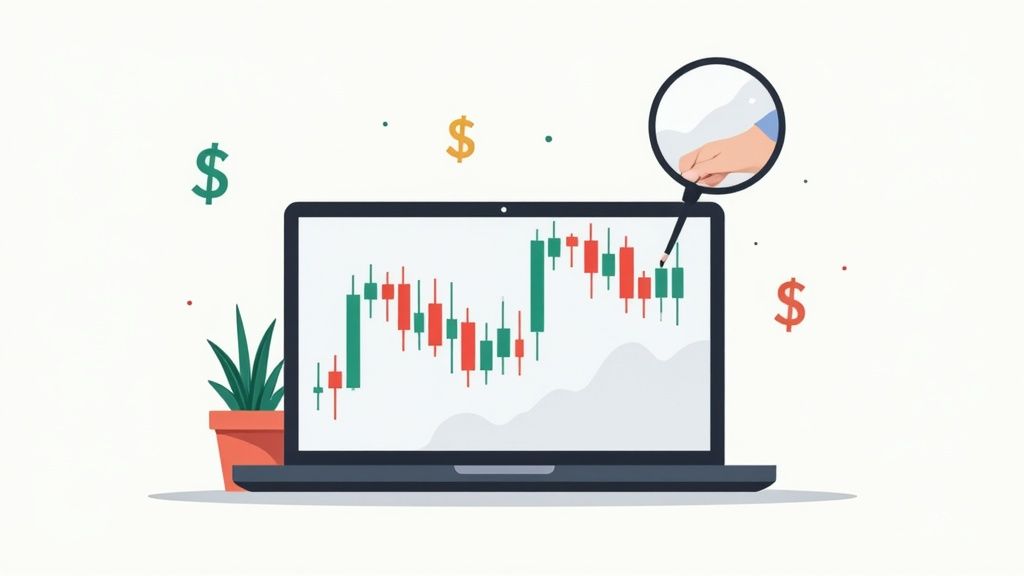
Welcome to the world of forex trading. Before you dive into complex algorithms or "secret" signals, let's focus on your most powerful tool: the chart right in front of you.
Think of it as a live storybook. Every tick and candle chronicles the constant tug-of-war between buyers (bulls) and sellers (bears). Learning to read that story is your first and most important step toward making smart, informed trades.
For a newcomer, the screen can look like a chaotic mess of lines and colors. Don't worry. It all starts with understanding the basic ways price is drawn on the chart.
The Three Main Chart Types
Most trading platforms give you a few ways to visualize the market's pulse. Each has its own purpose and offers a different level of detail. Let's break them down so you can choose the right tool for the job.
Here’s a quick rundown of the big three and what they're good for:
Quick Guide to Forex Chart Types
| Chart Type | What It Shows | Best For |
|---|---|---|
| Line Chart | A single line connecting closing prices. | Seeing the big-picture trend at a glance. |
| Bar Chart | Open, High, Low, and Close (OHLC) prices. | Analyzing volatility within a period. |
| Candlestick Chart | Open, High, Low, and Close (OHLC) prices. | Quickly interpreting market sentiment and momentum. |
While all three have their place, you’ll find that most experienced traders live and breathe by candlestick charts. Let's see why.
- Line Charts: This is your most basic view. It connects the closing prices over time, giving you a clean, simple line. It’s perfect for spotting long-term trends without noise, but it hides the intraday price swings.
- Bar Charts: These take it up a notch. Also known as OHLC charts, they show the Open, High, Low, and Close for each period. Suddenly, you can see how volatile the market was—a huge piece of the puzzle that line charts leave out.
- Candlestick Charts: This is the go-to for the vast majority of traders, and for good reason. They show the same OHLC data as bar charts, but the visual design—a solid "body" with thin "wicks"—makes it incredibly intuitive to gauge market sentiment in an instant.
Candlestick charts, which trace back to 18th-century Japanese rice traders, are incredibly information-dense. Each candle gives you four critical data points, making them a powerful tool for dissecting market dynamics. That level of detail is essential in a market where daily trading volumes averaged a staggering $7.51 trillion in April 2022. That immense liquidity fuels the price action you’re trying to decode. Discover more insights about forex trading volume on bestbrokers.com.
Line and bar charts definitely have their uses, but we’re going to spend most of our time on candlesticks because they’re the industry standard. They don’t just give you numbers; they show you the market’s mood. A long green candle screams buying pressure, while a small red one with long wicks hints at confusion and indecision. This is your first step to gaining actionable insights.
Of course, before you can analyze the candles, you need to know what you're even looking at. Be sure to get a handle on the assets themselves—you can learn more about how to read currency pairs in our article to build that foundation.
Next up, we’ll dive into what these candles are really telling you.
Reading the Story of Candlestick Patterns
Okay, we’ve looked at the big three chart types, but let's be honest—for most of us, it’s all about the candlestick chart. If a line chart gives you the headline, candlesticks give you the full, unfiltered story. Each candle is a rich, visual summary of the battle between buyers and sellers within a specific timeframe.
Think of every single candle as a chapter in the market's story. Learning to read these chapters, both individually and strung together, is one of the most fundamental and valuable skills you'll develop as a trader.
Deconstructing a Candlestick
Before you can spot patterns, you need to understand the anatomy of a single candle. It looks more complex than it is, but every piece tells you something important. Each candle simply represents all the price action over whatever period you’ve chosen—a minute, an hour, a day, you name it.
Every candle is made of two key parts:
- The Body: This is the thick, rectangular part. It shows you the distance between where the price opened and where it closed for that period. The color is your first clue: a green (bullish) candle means the price closed higher than it opened. A red (bearish) candle means it closed lower. Simple.
- The Wicks (or Shadows): These are the thin lines sticking out from the top and bottom of the body. The very top of the upper wick is the highest price the market hit during that period, and the bottom of the lower wick is the lowest.
Here's an actionable tip: pay attention to wick length. Long wicks can signal volatility and indecision. It means the price traveled a long way but was pushed back before the candle closed. Conversely, a candle with a large body and tiny wicks suggests strong, decisive momentum.
For a deeper dive into the nitty-gritty, our guide on how to read candlesticks in financial markets is a great next step.
Common Patterns That Signal Market Moves
A single candle tells you a lot, but the real magic happens when you see them forming patterns together. These are recurring formations that can give you a heads-up about a potential trend reversal or suggest the current trend is just getting started. They aren't crystal balls, but they are powerful clues about market psychology.
Let's walk through a few of the most important ones you'll see time and time again.
Reversal Patterns: Clues of a Turning Tide
Reversal patterns suggest the current trend is losing steam and might be about to flip. Spotting one of these near a key support or resistance level can be a game-changing insight.
A classic example is the Hammer. This pattern appears after a downtrend and has a short body at the top with a long lower wick. It visually represents buyers stepping in with force to push the price back up after sellers tried to tank it, signaling that bullish momentum might be building.
Another powerful reversal signal is the Engulfing pattern.
- A Bullish Engulfing pattern happens when a big green candle completely "engulfs" the body of the previous, smaller red candle. It's a dramatic visual shift showing that buyers have just overwhelmed the sellers.
- A Bearish Engulfing is the opposite—a huge red candle swallows the previous smaller green one, signaling that sellers have seized control.
Actionable Insight: Imagine you're watching the EUR/USD pair drift lower. Suddenly, a Bullish Engulfing pattern forms right on top of a known support level. This isn't random noise; it's a powerful visual cue that selling pressure is exhausted and a rally could be on the cards.
Continuation Patterns: Signs the Trend Will Keep Going
Not every pattern is about a dramatic reversal. Some just tell you that after a quick breather, the trend you're in is likely to keep rolling.
One of the most straightforward is a series of large-bodied candles of the same color. For example, seeing three long green candles in a row (often called "Three White Soldiers") is a strong confirmation that the bullish trend is healthy and has more room to run.
The Indecisive Doji
Sometimes, the market just pauses, completely unsure of its next move. This moment of indecision is perfectly captured by the Doji candlestick. A Doji has a tiny, almost non-existent body, meaning the open and close prices were nearly identical. It often has long upper and lower wicks, making it look like a cross or a plus sign.
A Doji represents a stalemate between buyers and sellers. When you see a Doji pop up after a strong, established trend, it’s an early warning sign that momentum is fading. It’s the market taking a deep breath before deciding where to go next.
When you put it all together, candlestick patterns are the language of the market. They turn a sterile price chart into a dynamic narrative of fear, greed, and indecision. Learning to interpret this story is your next big step toward becoming a more confident and analytical trader.
Adding Technical Indicators to Your Analysis
Candlestick patterns give you a fantastic real-time look at market psychology, but what if you want to add a layer of statistical muscle to your analysis? This is where technical indicators come in. Think of them as specialized lenses you can overlay on your chart to help clarify the story the price is telling.

Now, indicators aren't magic crystal balls; they are simply mathematical calculations based on historical price or volume. Their real job is to help you make more objective, data-driven decisions about where the price might go next.
We’ll focus on three of the most trusted types: trend, momentum, and volatility indicators.
Tracking the Trend with Moving Averages
One of the first questions to ask when you open a chart is, "Which way is the market headed?" Moving Averages (MAs) are the perfect tool for getting a quick, clean answer.
An MA smooths out the raw price data by creating a constantly updated average price. This helps you filter out the "noise" from short-term price spikes and see the underlying trend more clearly. The two you'll run into most often are the Simple Moving Average (SMA) and the Exponential Moving Average (EMA).
- Simple Moving Average (SMA): This is the simple average of a price over a set number of periods. A 50-day SMA, for example, adds up the closing prices for the last 50 days and divides by 50.
- Exponential Moving Average (EMA): This one is a bit more sophisticated. It gives more weight to the most recent prices, which makes it react more quickly to new price action.
A classic strategy traders watch for is the "crossover." This happens when a shorter-term MA (like a 50-day) crosses above or below a longer-term MA (like a 200-day). For instance, when the 50-day MA crosses above the 200-day MA—an event known as a golden cross—it often signals a higher probability of price appreciation.
Given that spot trading in the US forex market accounted for roughly $602.29 billion of daily turnover in April 2025, these volumes create rapid changes that indicators help us interpret. You can get more details on global currency market activity from Statista.
Measuring Momentum with the RSI
Moving averages are great for showing you the direction of the trend, but they don't tell you how strong it is. To get a feel for the power behind the move, we turn to momentum indicators like the Relative Strength Index (RSI).
The RSI is an oscillator that moves on a scale from 0 to 100. It measures the speed and change of price movements, helping you spot potentially "overbought" or "oversold" conditions.
Here’s the general interpretation:
- Overbought: A reading above 70 suggests a currency pair might be over-valued and due for a pullback.
- Oversold: A reading below 30 suggests the pair could be under-valued and poised for a rebound.
Actionable Insight: A common mistake is to sell the moment the RSI hits 70. A strong trend can stay "overbought" for a long time! A smarter approach is to use it as a warning sign. Wait for the RSI to cross back down below 70 and look for a bearish candlestick pattern to confirm that momentum is actually shifting.
The RSI is also fantastic for spotting divergence. This is when the price makes a new high, but the RSI makes a lower high. This "bearish divergence" is a classic clue that the underlying momentum is weakening and the trend could be losing steam.
Understanding Volatility with Bollinger Bands
The forex market isn't always trending smoothly. Volatility indicators like Bollinger Bands help you gauge the current market mood.
Created by John Bollinger, this indicator plots three lines directly on your price chart:
- A simple moving average in the middle (usually a 20-period SMA).
- An upper band (two standard deviations above the SMA).
- A lower band (two standard deviations below the SMA).
When volatility is high, the bands expand. When the market is quiet, they contract or "squeeze." This squeeze is a trader's best friend—it often signals that a big, explosive move is brewing.
Traders use Bollinger Bands in a few clever ways. Some view the upper and lower bands as dynamic support and resistance levels. For example, if the price touches the lower band and then prints a strong bullish candle, it could be a solid buy signal.
By combining these three types of indicators, you get a much richer view of what's happening. You can use moving averages to confirm the trend, the RSI to gauge its strength, and Bollinger Bands to understand the current volatility. Together, they help you build a more complete, logical case before you place a trade.
Drawing Support, Resistance, and Trend Lines
While automated indicators are great, some of the most powerful insights come from tools you draw yourself. Learning to interact directly with the chart is a huge step forward. It forces you to see the market's underlying structure and pinpoint the real battlegrounds between buyers and sellers.
This hands-on approach shifts you from being a passive observer to an active analyst. These simple lines provide critical context to candlestick patterns and indicator signals, helping you build a much stronger case for every trade you consider.
Identifying Support and Resistance Levels
Think of support and resistance as price floors and ceilings. These are horizontal levels on your chart where the price has repeatedly struggled to push through, representing zones where demand (support) or supply (resistance) is concentrated.
- Support: This is a price "floor" where buying pressure has historically been strong enough to stop a fall and cause the price to bounce back up.
- Resistance: This is the opposite—a price "ceiling" where selling pressure has consistently overwhelmed buyers, forcing the price back down.
To find these levels, scan your chart for areas where the price has reversed multiple times. The key is to connect at least two or three significant swing lows (for support) or swing highs (for resistance) with a horizontal line.
Pro Tip: Don't treat support and resistance as razor-thin lines. It’s far more realistic to see them as zones or areas. Price often pokes through a level slightly before reversing, and thinking in zones will keep you from getting faked out by these small overshoots.
A powerful concept to watch for is "role reversal." When a major resistance level is finally broken, it often becomes the new support level. The psychology of the market flips; traders who were selling at that ceiling now see it as a bargain and start buying at the new floor.
How to Draw Effective Trend Lines
If support and resistance map out the horizontal barriers, trend lines help you visualize the direction and momentum of the current trend. These are diagonal lines that connect key price points, essentially acting as dynamic boundaries for the price.
Drawing them is simple, but it takes a bit of practice to get a feel for it.
- For an uptrend: Draw a line connecting two or more significant swing lows. This line should sit below the price, acting as a rising floor of support. Every time the price pulls back, touches this line, and bounces, it's another confirmation of the uptrend's strength.
- For a downtrend: Do the opposite. Connect two or more significant swing highs. This line will sit above the price, creating a falling ceiling of resistance.
Pay attention to the angle of your trend line—it tells a story. A steep line suggests powerful momentum that might burn out quickly, while a shallow line points to a weaker, more gradual trend.
A break of a well-established trend line is often one of the earliest warnings that a trend might be losing steam or reversing. But just like with support and resistance, don't jump the gun. Always wait for extra confirmation, like a strong candlestick pattern, before acting on a trend line break alone.
Once you get comfortable with these simple drawing tools, you can define potential entry and exit points with far more confidence. For instance, a bullish engulfing pattern that forms right on a major support level is a much stronger signal than one just floating in the middle of a chart. This is how you start layering your analysis to build a truly robust trading strategy.
Putting It All Together: A Real-World Chart Analysis
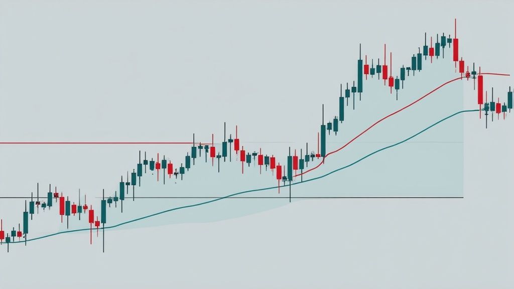
Theory is great, but the real test is applying it to a live chart. Let's walk through a complete analysis to see how these concepts layer together to build a trading story. This is the practical process of reading a forex chart to create a clear, actionable plan.
We'll use a recent daily chart of the EUR/USD pair for this exercise. The goal is to show you how to combine trend analysis, key price levels, candlestick patterns, and a couple of simple indicators to form a solid trading idea.
Here’s a look at a typical trading platform, something like MetaTrader, where all this analysis comes to life.
This is our sandbox. On a platform like this, we can pull up historical data, draw our lines, and apply indicators to figure out what the market is telling us. It’s an incredible advantage we have today that traders of the past could only dream of.
Starting with the Big Picture
First things first, always zoom out to get your bearings and identify the primary trend. Looking at this daily chart, it's immediately obvious that we're in a downtrend, marked by a series of lower highs and lower lows.
To make this crystal clear, I'll draw a diagonal trend line connecting the recent swing highs. This line now serves as our dynamic resistance, a visual reminder of the downward pressure.
Next up, I'm hunting for major horizontal support and resistance zones. I see a key support level right away—price has bounced off this area twice before, creating a very clear price floor. This zone is critical; a clean break below it could signal the downtrend is ready for its next leg down, but a strong bounce might hint at a reversal.
With this basic "map" of the market structure in place, we can now zoom in and start looking for more specific clues.
Pinpointing Entries with Candlesticks and Indicators
So, we know the context: a downtrend approaching a major support level. Now, we watch the price action for tells. As the price nears our support zone, I notice that the bearish (red) candles are getting smaller and showing longer lower wicks. This suggests the sellers might be running out of steam.
To get more confirmation, I'll add two of my favorite indicators:
- A 20-period Exponential Moving Average (EMA) to give me a sense of the short-term trend.
- The Relative Strength Index (RSI) to check the underlying momentum.
Just as price taps our support level, a huge Bullish Engulfing candle forms. That's a powerful reversal signal you can't ignore. At the exact same time, I glance down at the RSI and see it's climbing out of "oversold" territory (below 30).
This is what we call confluence. We have a strong candlestick pattern at a key support level, backed up by a momentum shift on the RSI. This combination builds a solid case for a potential long (buy) trade.
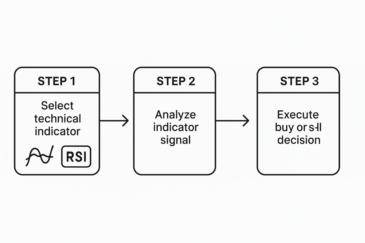
Here's the simple three-step process for how a trader might integrate an indicator into their decision-making.
It’s a straightforward flow: pick your tool, analyze its signal, and use that insight to execute a trade. You're turning data into a decisive action.
Building the Complete Trading Plan
The final piece of the puzzle is defining the trade itself. Based on this analysis, a good potential entry point would be just above the high of that Bullish Engulfing candle, waiting for confirmation that buyers are in control.
But an entry is useless without proper risk management:
- Stop-Loss: I'd place my stop-loss order just below the low of that support zone. This is my safety net. If I'm wrong and the downtrend continues, my capital is protected from a catastrophic loss.
- Take-Profit: A logical first target would be that descending trend line we drew earlier. It's a high-probability spot for sellers to step back in, making it a great place to take some or all of the profit off the table.
By combining these different layers of analysis, we've moved from simply staring at a chart to building a complete trading narrative. We identified the overall trend, pinpointed a critical decision zone, waited for a specific price action signal, and confirmed it with an indicator. This is how you systematically turn chart data into a high-probability trading plan.
It's worth remembering that the ease with which we can access this historical data is a game-changer. Platforms like MetaTrader 4 and 5 have made professional-grade charting available to everyone. We can analyze everything from candlestick patterns to volatility shifts across different market cycles—something that was impossible before the digital age.
These charts aren't just squiggles; they reflect the dynamic interplay of trillions of dollars moving daily, a fact confirmed by institutions like the Federal Reserve Bank. You can even check out the reported daily volumes from the New York Fed. This makes historical chart data one of the most indispensable tools a trader has.
A Few Common Questions From The Trading Floor
Even after you get the hang of the basics, reading charts in real-time brings up new questions. It's totally normal. Let's walk through some of the most common things that trip up new traders so you can tackle them with confidence.
What’s the Best Time Frame to Use?
This is the million-dollar question! The honest answer is that there isn't one. The "best" time frame is the one that fits your trading style and personality.
It all comes down to how long you plan on being in a trade.
- Are you a day trader? You're likely living on the 5-minute and 15-minute charts, hunting for quick intraday moves.
- More of a swing trader? You'll probably feel more at home on the 4-hour and daily charts, where you can catch those bigger, multi-day swings.
Actionable Tip: Get comfortable with multi-timeframe analysis. Always start by looking at the daily chart to understand the main trend. Then, drill down to a 1-hour or 4-hour chart to pinpoint your exact entry. It’s like using a map to find the city, then GPS to find the street.
How Many Indicators Should I Clutter My Chart With?
It's easy to fall into this trap. You discover a new indicator and think, "This is it!" Before you know it, your chart looks like a bowl of spaghetti, and you're paralyzed by conflicting signals.
Trust us on this: less is more. Your goal is a clean chart that provides clear signals, not one that whispers a dozen different suggestions.
A solid, clean setup to start with might just be two or three indicators that work well together. For instance:
- A trend indicator like a Moving Average to tell you which way the river is flowing.
- A momentum indicator like the RSI to tell you how fast it's flowing.
This combination gives you a great balance of information without creating a confusing mess. You can always add more later, but start clean.
Can I Learn This Stuff Without Losing Real Money?
Not only can you, but you absolutely should. Jumping in with real money before you're ready is the fastest way to blow up your account.
Every decent forex broker out there offers a free demo account. Think of it as a flight simulator for traders. It's loaded with virtual money but uses real, live market data.
This is your sandbox. It’s the perfect place to practice reading charts, drawing lines, testing indicators, and getting a feel for placing trades—all without the stress of losing your hard-earned cash.
Treat your demo trading seriously, as if the money were real. Practice until you feel confident and are consistently spotting good trades. Only then should you even think about putting real capital on the line.
Ready to move from theory to action? At Agfin Ltd, our mission is to make this click for you. Our platform, Finance Illustrated, has a free 60-minute Forex course, fun quizzes, and the risk-free trading simulators we just mentioned. It’s the best way to build your skills before you ever risk a dime. Start your learning journey with us today.