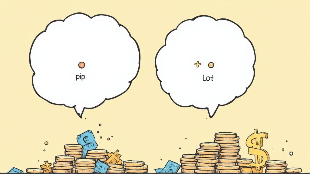
Figuring out your risk reward ratio is as simple as dividing what you could lose by what you could win. It’s quick math that tells you how much bang you're getting for your buck on every single trade. This simple number is one of the most powerful tools for making smart, calculated decisions in the wild world of investing.
What Is the Risk Reward Ratio, Really?

Think of the risk reward ratio as your secret map in the trading jungle. It’s a super simple concept that helps you decide if a trade is a smart move or just a hopeful gamble. Before you even think about clicking "buy," it makes you answer the most important question: "Is this actually worth it?"
Let's use a real-world example. Imagine you’re looking at a pair of limited-edition sneakers from a collaboration with a huge celebrity, like Travis Scott. You could buy them for $200, hoping to sell them for $500 as the hype builds. Your potential reward is $300. But, if the hype dies down, the price could drop to $150. Your potential risk is $50.
In this scenario, you're risking $50 for a chance to make $300. That's a solid bet.
From Sneakers to Stocks
This exact same logic is what separates smart investors from gamblers in the stock market. The risk reward ratio forces you to weigh the potential upside against the potential downside before your money is on the line. As the legendary investor Paul Tudor Jones famously said, "The most important rule of trading is to play great defense, not great offense." This ratio is your best defensive move.
It keeps your decisions based on logic, not emotion. Instead of trading because of a gut feeling or hype you saw on TikTok, you’re using a clear, objective measure to guide you.
A good risk reward ratio can make you profitable even if you lose more trades than you win. It's not about being right all the time; it's about making sure your wins are big enough to matter.
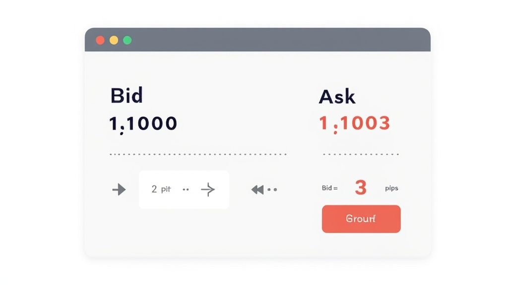
So, what do these ratios actually mean? The table below breaks it down, giving you a quick cheat sheet to see if a potential trade makes the cut.
Understanding Risk Reward Ratios
This table breaks down different ratios to help you quickly assess a potential trade.
| Ratio | What It Means | Is It a Good Bet? |
|---|---|---|
| 1:1 | You risk $1 to potentially make $1. | Neutral. You need a win rate over 50% to be profitable. |
| 1:2 | You risk $1 to potentially make $2. | Getting better. Your wins are twice as big as your losses. |
| 1:3 | You risk $1 to potentially make $3. | Excellent. This is where you want to be for long-term success. |
| 2:1 | You risk $2 to potentially make $1. | Very risky. Your losses are bigger than your potential wins. Avoid! |
As you can see, the bigger the potential reward for the risk you're taking, the better your chances are in the long run. A trader who only takes 1:3 trades can be wrong more often than right and still make money. That's the power of putting math, not feelings, in charge.
The Simple Math Behind Your Trades
Ready for the formula? I promise it’s way easier than your high school algebra class.
Figuring out your risk reward ratio just means plugging three simple numbers into one equation. Seriously, this little piece of math is your secret weapon for making smarter, logical trades instead of just guessing.
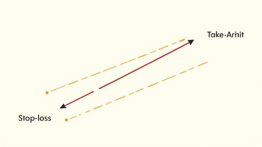
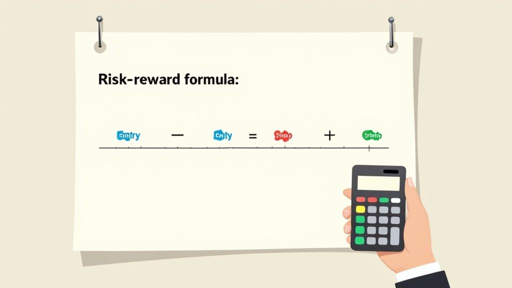
The formula is: (Target Price – Entry Price) / (Entry Price – Stop-Loss Price)
It might look a bit formal, but let's break down what each part actually means. Think of it like planning a road trip- you need to know your starting point, your destination, and where you'll pull over if you run low on gas.
Getting Your Key Numbers Straight
Before you can do the math, you need the numbers. Every single trade you even think about making will have these three key prices.
- Entry Price: This one's easy. It's the price you pay to buy the stock, crypto, or whatever you're trading. It’s your starting line.
- Target Price: This is your goal- the price where you plan to sell and take your profit. It's the destination you're aiming for.
- Stop-Loss Price: This is your safety net. It’s the price you set ahead of time where you'll sell to cut your losses if the trade goes against you.
Once you have these three numbers, you're ready to see if a trade is actually worth taking. This quick calculation is a fundamental tool investors use all over the world to weigh what they might lose against what they could gain.
For example, if you risk $200 for a potential $600 profit, your risk reward ratio is an awesome 1:3.
Let's Put It Into Action
Let's walk through a real-world scenario. Imagine you’re looking at a stock that's currently trading at $50.
You decide to buy it, so your Entry Price is $50. After some research, you set a profit goal, deciding you’ll sell if it hits $65. That's your Target Price. Finally, you decide that if the stock drops to $45, you’re out. This is your Stop-Loss Price.
Now, let's plug these into our formula:
- Potential Reward: $65 (Target) – $50 (Entry) = $15
- Potential Risk: $50 (Entry) – $45 (Stop-Loss) = $5
- The Ratio: $15 / $5 = 3
This gives you a risk reward ratio of 1:3. In simple terms, for every $1 you're risking, you stand to make $3. That's a solid setup that many professional traders actively look for.
Before you start applying this to every trade, you can really sharpen your skills by exploring our guide on how to backtest trading strategies. And if you want to go deeper into the probability side of things, it’s worth learning how to calculate Expected Value.
Why a Good Ratio Is Your Secret Weapon
Let’s get one thing straight: successful trading isn't about having a crystal ball. It’s not about being right on every single trade. It's about making sure your winning trades are big enough to completely crush your losing ones.
Think of a solid risk reward ratio as your statistical advantage. Many pro traders are profitable on less than half of their trades. Their secret isn't magic; it's math. They've mastered the art of letting their winners run and cutting their losers short.
Making a Profit While Being Wrong Most of the Time
This might sound weird, but it's where the power of this concept really shines. Let's walk through a quick scenario.
Imagine you decide on a 1:3 risk reward ratio for your next 10 trades. For every trade, you're willing to risk $100 with the goal of making a $300 profit.
- You hit your profit target on 4 of those trades: 4 x $300 = +$1,200
- You get stopped out on the other 6 trades: 6 x $100 = -$600
Even though you were wrong more often than you were right, you still ended up with a $600 net profit. That’s the cushion a disciplined ratio builds into your strategy. It allows you to handle the losses that will inevitably happen without blowing up your account.
This approach also has a huge psychological benefit. When you've defined your max loss and your potential gain is worth the risk, you're far less likely to make emotional decisions fueled by fear or greed.
"The most important thing in making money is not letting your losses get out of hand." – Marty Schwartz
History backs this up. While the U.S. stock market has generated awesome long-term returns, it’s also had some absolutely brutal years. In 1931, during the Great Depression, the market crashed by a mind-blowing -43.54%. Having a personal risk management plan helps protect you from that kind of catastrophic loss. You can dive into more historical market performance data to see these swings for yourself.
Ultimately, a good risk reward ratio doesn't just manage your risk- it builds your entire path to long-term profitability.
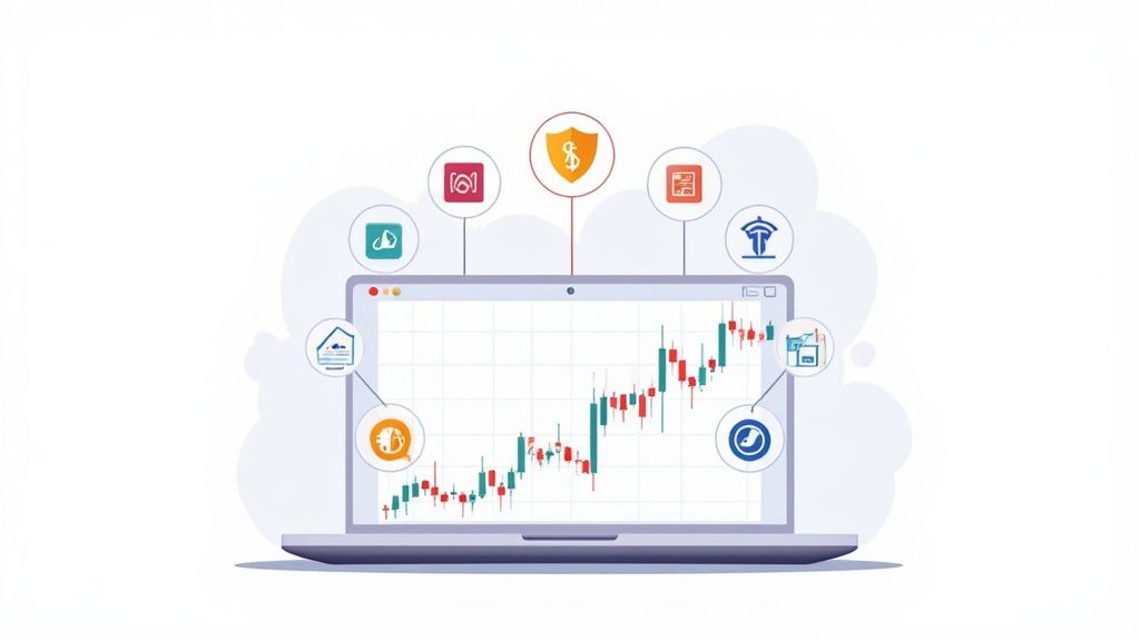
How to Find Your Risk and Reward Levels
Okay, so how do you actually pick your target and stop-loss prices without just throwing a dart at a board? It all comes down to looking for clues in a stock's past behavior. This is where we go from just knowing the formula to actually using it with confidence.
One of the most powerful tools for this is understanding support and resistance levels. Just think of these as invisible floors and ceilings for a stock's price.
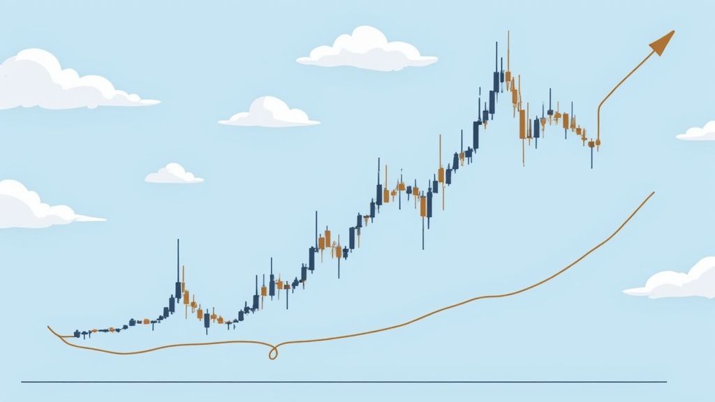
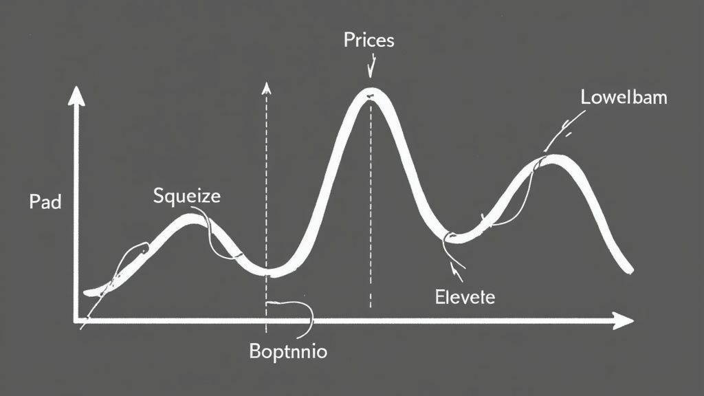
This infographic really shows how a disciplined approach to your wins and losses is what ultimately leads to profit over time.
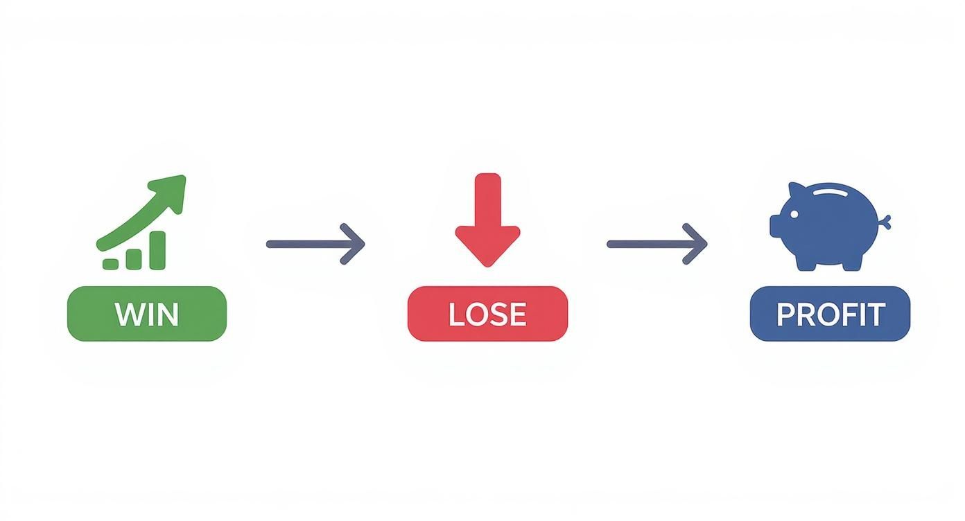
The big takeaway here? Your winning trades need to be way bigger than your losing ones if you want to build a profitable track record. It's that simple.
Using Price History to Your Advantage
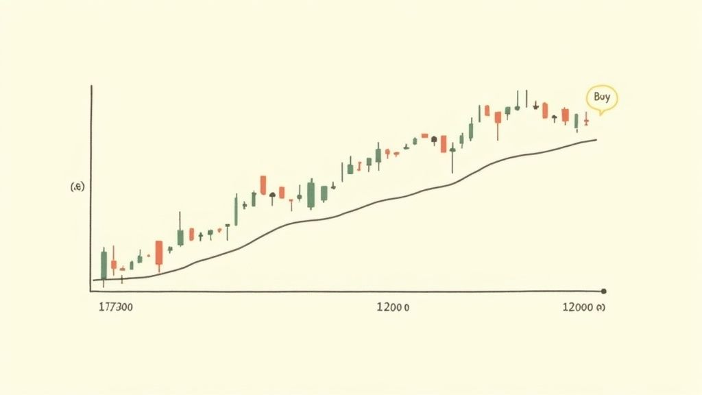
A support level is a price point where a stock has historically bounced back up after falling. It's like a floor where buyers tend to jump in and defend the price. This makes it a really logical place to set your stop-loss- just a little bit below that floor. If the price breaks through that historical safety net, it’s a strong signal that things might be headed down, fast.
On the other side, you have a resistance level. This is a price ceiling where a stock has struggled to break through in the past. It's where sellers often take control again. That makes it a great spot to set your profit target, maybe just a little below that ceiling to make sure your order gets filled.
Learning to spot these levels on a chart is a total game-changer. For a deeper dive, our simple guide on how to read forex charts is a great resource, as the principles are exactly the same for stocks.
Of course, there are other ways to do it. Another simple method is using a fixed percentage. For example, you might decide to always set your stop-loss 5% below your entry price, no matter what. This strategy is super simple and keeps your risk consistent across all your trades.
Ultimately, using techniques like these helps you define the exact numbers you need to plug into your risk reward ratio calculation. No more guesswork.
Common Trading Mistakes You Can Easily Avoid
Learning from the mistakes of others is one of the smartest shortcuts any trader can take. When you calculate your risk reward ratio, you're not just doing math; you're creating a battle plan. And the biggest mistake is abandoning that plan when things get intense.
So many traders fall into the emotional trap of moving their stop-loss down because they feel like a trade is about to turn around. This is a classic rookie mistake that can quickly turn a small, controlled loss into a huge one. Your original plan is your anchor in a stormy market- stick to it.
Another painful mistake is letting a winning trade turn into a losing one. You hit your profit target, but greed whispers, "Just a little more." The market then reverses, and you watch your hard-earned gains disappear. As Warren Buffett famously says, the first rule of investing is "Never lose money," and the second rule is "Never forget rule number one." Discipline, not hope, is your most valuable asset here.
Don't Use a One-Size-Fits-All Ratio
Applying the exact same risk reward ratio to every trade is a subtle but dangerous habit. Think about it: a volatile tech stock like Nvidia is a completely different beast than a stable, blue-chip company like Coca-Cola. Your strategy has to be flexible enough to match the asset and the current market vibe.
This isn't just theory. The risk profiles of major global markets vary a lot. Research from 1901 to 2022 showed that while Australia's classic 60/40 portfolio had the best returns, it also came with a terrifying maximum drawdown of -54.61%. For comparison, the U.S. market's was -44.88%.
This data makes it crystal clear that even in strong markets, the potential for huge losses is very real. It’s a powerful reminder that you need a tailored approach to risk. You can explore the full market performance research to see just how much these numbers can differ.
Common Questions, Answered
We get it. When you're new to the game, a term like "risk reward ratio" can sound a little intimidating and bring up a bunch of questions. Let's walk through some of the most common ones to clear things up and get you trading with more confidence.
What's a Good Risk-Reward Ratio for a Beginner?
While there's no single "magic number" that fits every trading style, a fantastic starting point for anyone learning is a ratio of 1:2 or higher.
Think of it this way: for every single dollar you're willing to lose, your goal is to make at least two. This simple rule forces your winning trades to have a much bigger impact than your losing ones, giving you a valuable cushion as you find your footing in the markets.
Can I Use This for Crypto, or Is It Just for Stocks?
Absolutely! The risk reward ratio is a universal trading principle. It doesn't matter if you're trading stocks, crypto, forex, or even things like gold and oil.
The core logic- measuring your potential upside against your potential downside- is fundamental to smart decision-making in any market. It's especially critical in volatile markets like crypto, where prices can swing dramatically in the blink of an eye.
Does a Good Ratio Guarantee I'll Make Money?
No, and this is a super important point to understand. A solid risk reward ratio is a powerful risk management tool, not a crystal ball that predicts the future. It doesn't, on its own, guarantee any single trade will be a winner.
Your success still depends on having a solid strategy for knowing when to get in and out of trades. The ratio simply makes sure that, over the long run, your profitable trades can more than cover your losses. That's the real secret to staying in the game.
To really get a handle on the bigger picture and build a truly strong investment strategy, it's always a good idea to learn from the masters. You can explore highly recommended investing books that dive deep into these foundational concepts.
Ready to put this into practice without risking a single cent? At financeillustrated.com, we believe learning should be hands-on and fun. Check out our free Trading School, test-drive your strategies with our realistic simulators, and build real confidence before you ever place a trade. Get started at https://financeillustrated.com.